
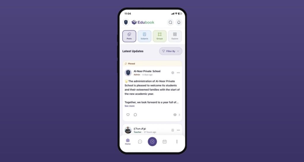
We’ve rebuilt the Edubook mobile app on a faster, more reliable foundation — so the school community you rely on every day now feels quicker, cleaner, and more at home on your phone.
A feed that stays out of your way
The header and tabs now collapse as you scroll, giving your content the full screen. Create a post and the feed brings you right back to the top, so you always see what you just shared. Trending posts now show every post type, including events, exams, articles, and polls, in a cleaner card.
Posts that are easier to read at a glance
Article posts get a redesigned card — a 16:9 cover, a clear مقال badge, a short excerpt, and an estimated reading time — so members know what they’re opening before they tap.
Events you can respond to in one tap
Event cards and the event details page now carry a streamlined RSVP flow, with a clear respondents list so organizers can see who’s coming at a glance.
Attachments that just work
The new composer groups media, audio, and files by type and validates them as you add them, so posts go out clean the first time.
Screens that work the same everywhere
Subjects, Groups, and Chat now share one layout: the same header, search row, cards, and bottom navigation. The back arrow appears only when you’ve opened a page from another, and on Android it matches your phone’s back gesture. Login and password reset also get a cleaner, refreshed design.
Text that’s easier on the eyes
Post and message text is now larger and bolder. The bottom bar marks your current tab with color alone, and custom profile fields show their first letter instead of a generic icon.
Likes and replies that make sense
Posts and comments now share one like icon. When you reply, the input shows who you’re replying to, and your reply appears in the thread right away.
A menu that fits your role
The main menu now shows only what your role uses, in the same order everywhere, with Posts always first. The account menu is grouped and trimmed, with a new guide icon for the User Manual.
Updates that reach you sooner
With over-the-air updates, improvements now arrive without waiting on an app store review — you’ll always be on the latest Edubook.
To help you settle into the new design, we’ve put together short video guides for the tasks you use most:
Sending a message
Browsing and reacting to posts
Editing your profile
Browsing and previewing subject material posts
Switching between your children’s accounts to follow their posts
Also in this release
- Smoother performance on Android.
- Messenger, calendar, timetable, weekly plan, assignments, results, online lessons, groups, subjects, articles, and files have all been carried over and verified on the new foundation.
- The profile header now collapses as you scroll, just like the feed.
- Fixed an issue where the keyboard covered fields while editing a member’s profile.
- Fixed an issue where loading more viewers on a popular post jumped back to the top of the list.
- Fixed an issue that prevented parents from submitting assignments.
